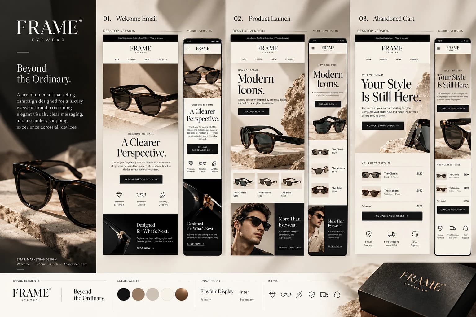
The challenge
Make a playful category feel premium without losing appetite appeal, warmth or the instant energy expected from an ice-cream brand.
FROSTY is a fictional ice-cream brand and campaign concept built around one simple idea: make indulgence feel joyful, premium and instantly recognizable. Pink, cocoa and cream become a flexible system across flavor advertising, packaging, retail and digital touchpoints.
Explore the brand world
The project turns an expressive food category into a coherent visual identity. Instead of treating every post as a separate artwork, the campaign repeats a small set of recognizable cues—bold product photography, generous type, creamy drips and a tightly controlled palette.
Make a playful category feel premium without losing appetite appeal, warmth or the instant energy expected from an ice-cream brand.
A compact wordmark, melting-cream motif, tactile ingredient imagery and a pink–cocoa–cream palette connect every touchpoint into one recognizable family.
The identity balances friendly curves with editorial typography. Strawberry pink brings energy, cocoa adds depth and warm cream gives the system enough breathing room to move between playful and premium.
#F28FAE#4B1714#F6E8D7#C83D5B#24100EThe three hero flavors establish the advertising language through product-first compositions, tactile ingredients and short, memorable headlines.

Bright fruit, soft pink and a playful splash language make the flavor feel fresh and celebratory.

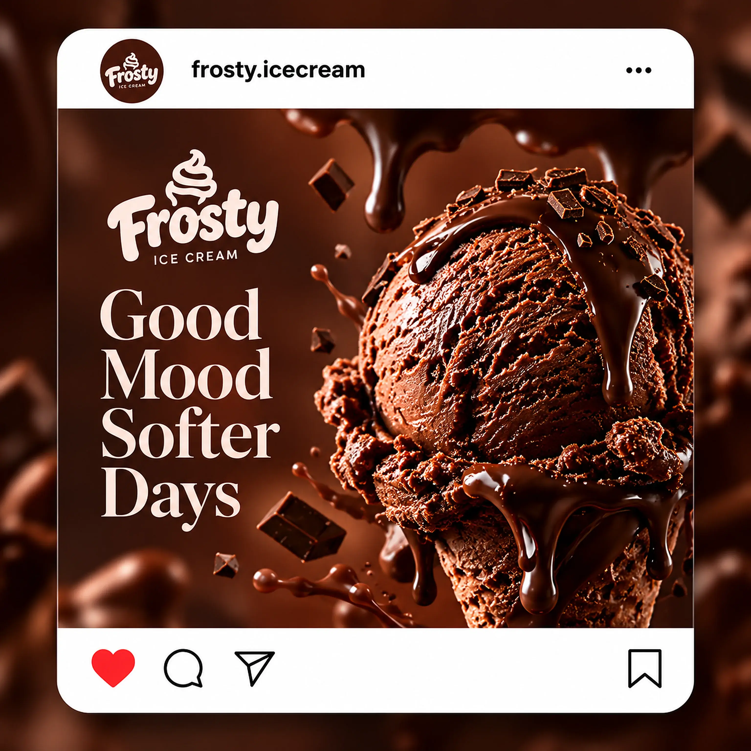
Deep cocoa tones, glossy chocolate and harder contrast create the richest expression in the system.

Warm cream and soft highlights prove that the identity can become quieter without losing recognition.
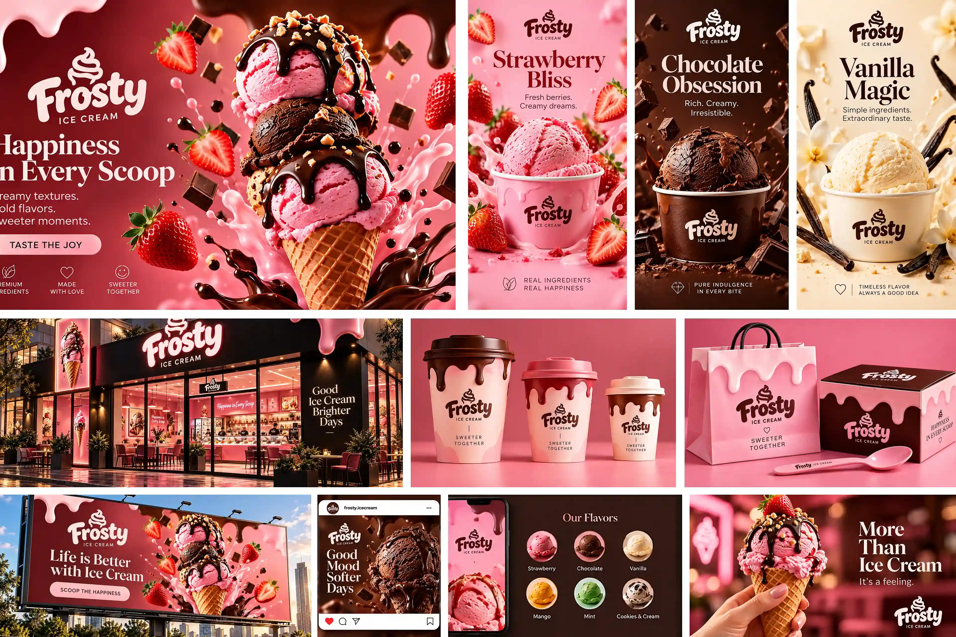
The same visual cues extend into packaging, a concept storefront, outdoor advertising, social media and lifestyle communication—showing how the brand can stay consistent while the format changes.

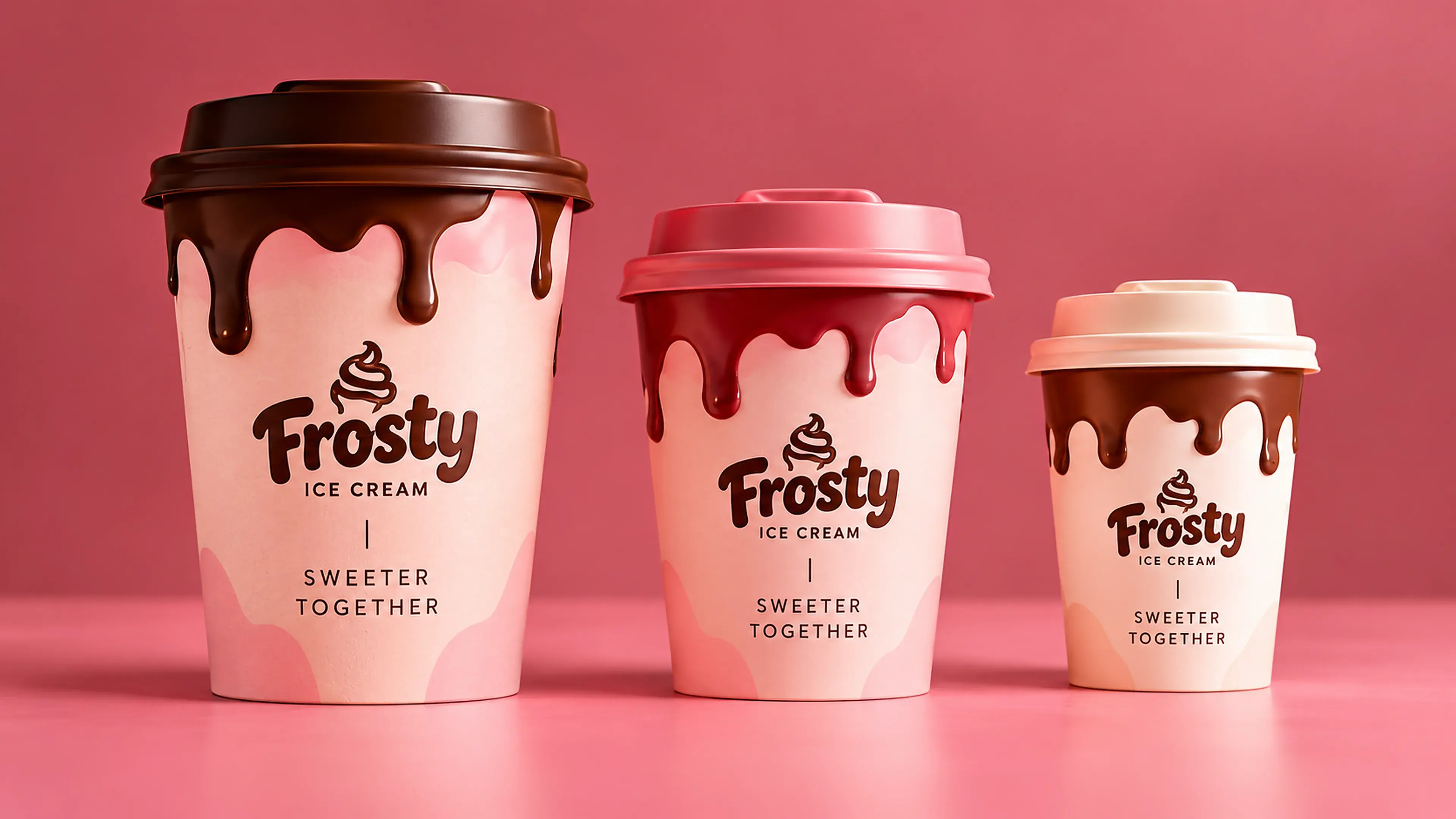
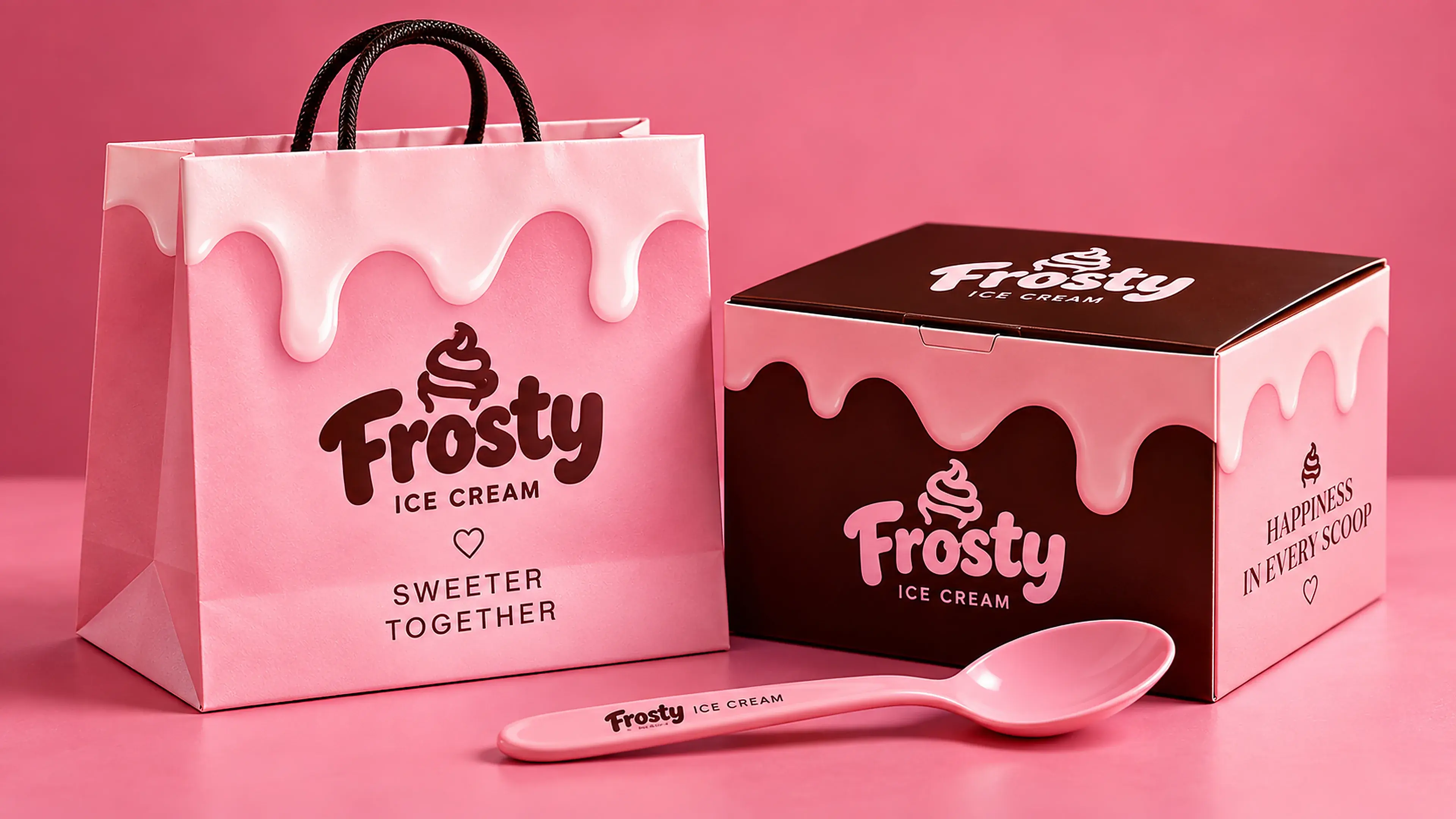
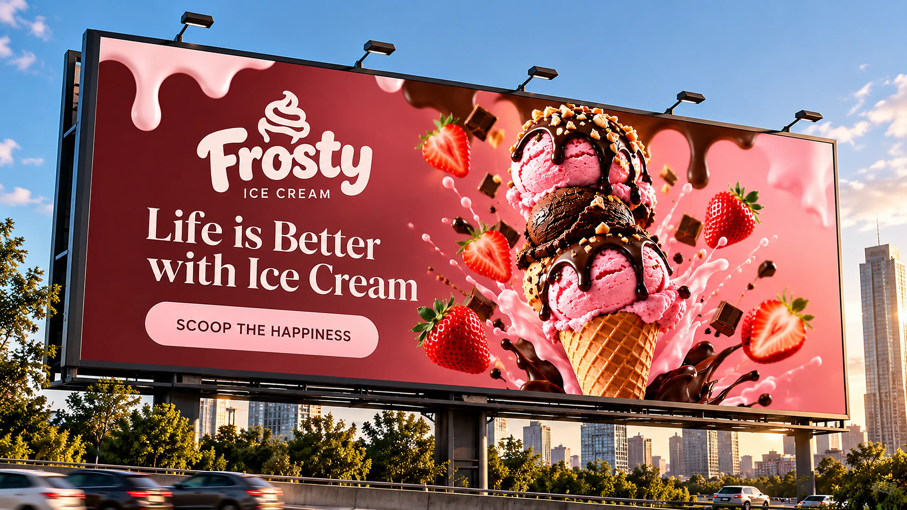

The complete presentation brings flavor advertising and brand applications into a single frame, making the consistency of the art direction visible at a glance.
View the work in detail, explore its visual direction, and save your favorites.