Create three distinct lifecycle messages that look and feel like a single premium brand, without relying on constant promotions or misleading urgency.
SELF-INITIATED / EMAIL DESIGN / E-COMMERCE / 2026FRAME EYEWEARDesigned to be opened.
Designed to be opened.
Made to be remembered.
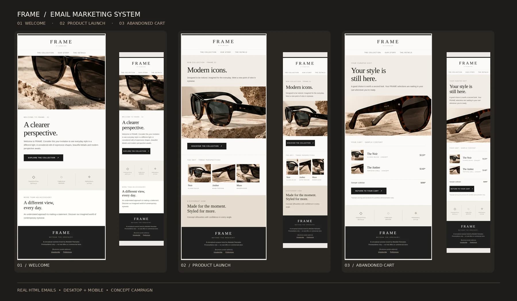
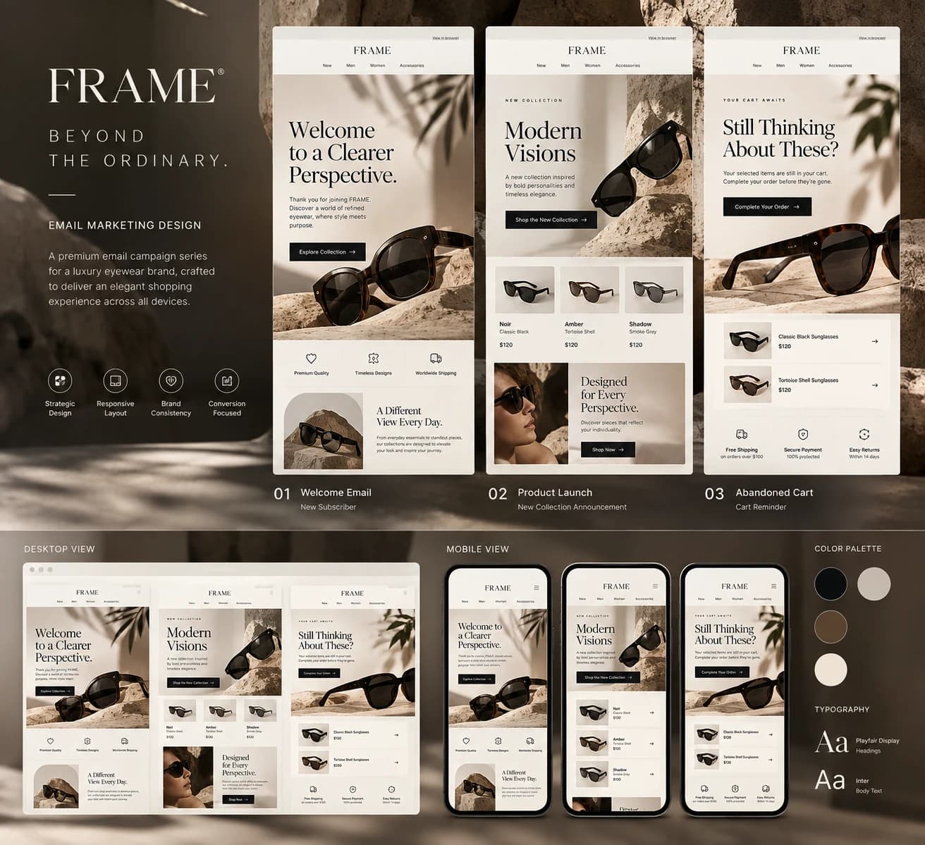
Three emails. Two screen sizes. One cohesive visual language. FRAME is an original, fictional luxury-eyewear email marketing study designed around editorial restraint, generous white space and a clear shopping journey.
Explore the campaign03Email journeys
02Responsive views
01Editorial identity
01 / THE BRIEF
An inbox worth opening.
Marketing emails often feel crowded, urgent and interchangeable. This project explores a quieter approach: elegant product imagery, purposeful hierarchy, concise copy and one unmistakable action at a time. The result is a connected welcome-to-purchase journey for an imagined FRAME collection.
Start with a monochrome wordmark; build an editorial beige-and-black palette; create table-based HTML emails that adapt to smaller screens; and validate actual desktop and mobile browser renders.
02 / VISUAL LANGUAGE
The luxury is in the restraint.
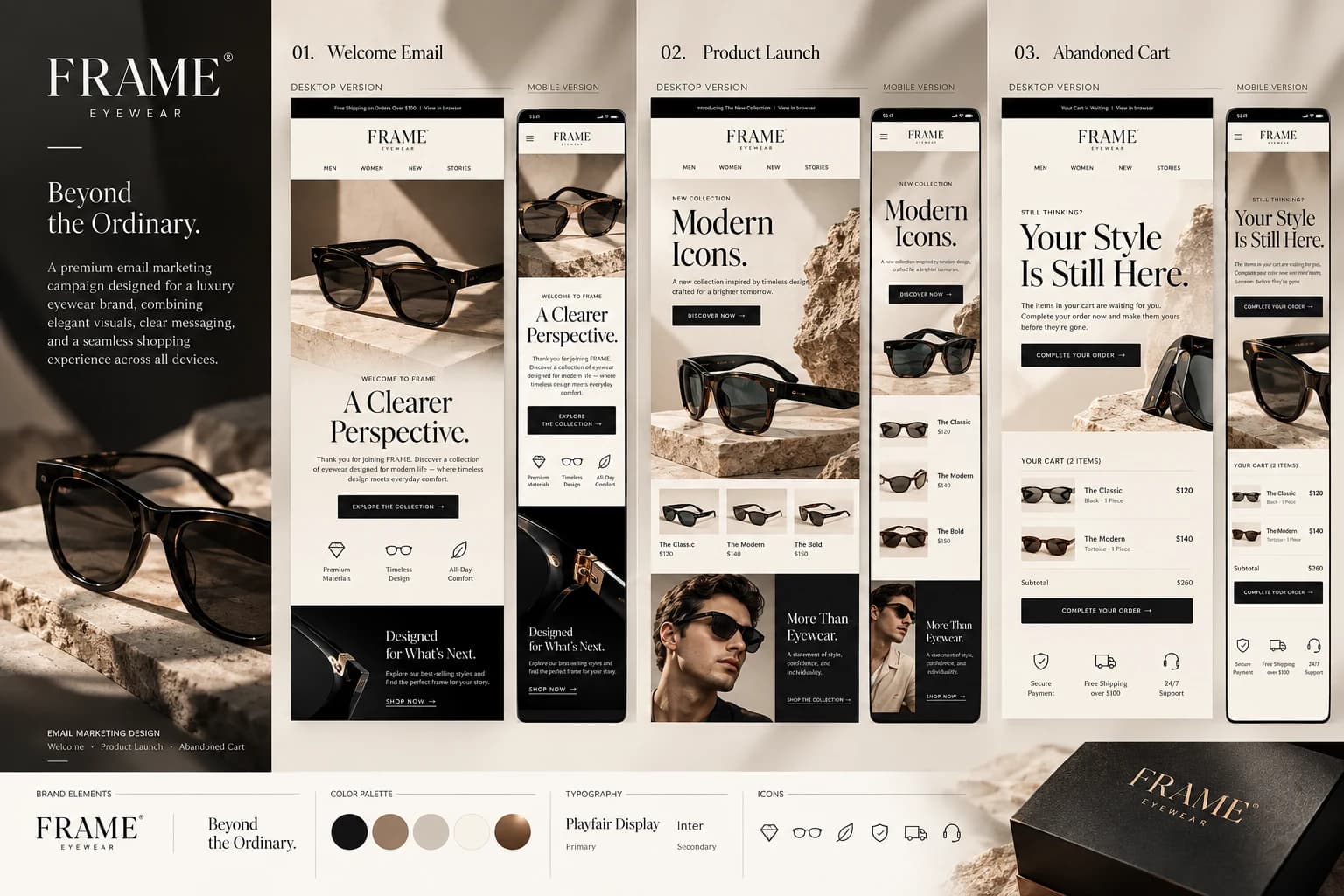
The same art direction connects the welcome, launch and cart messages: carefully framed eyewear, architectural stone, generous negative space and strong typographic rhythm.
FRAMEBEYOND THE ORDINARY
COLOR SYSTEM
CHARCOAL
#211f1dSTONE
#8b7260SAND
#d2c5b8IVORY
#f7f3edBRONZE
#674b38AI-assisted concept product photography with sculpted light and warm stone textures.
An elegant serif headline and email-safe sans-serif supporting copy create hierarchy without excess.
03 / THE EMAILS
A connected customer journey.
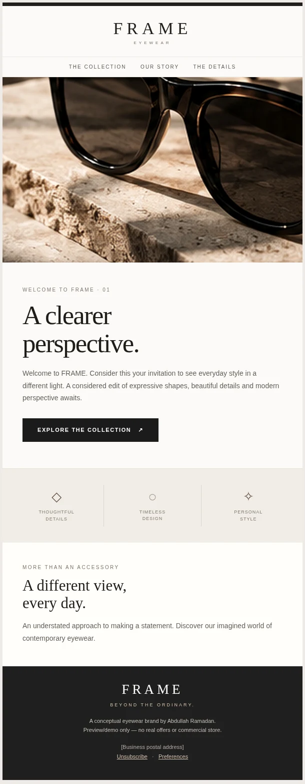
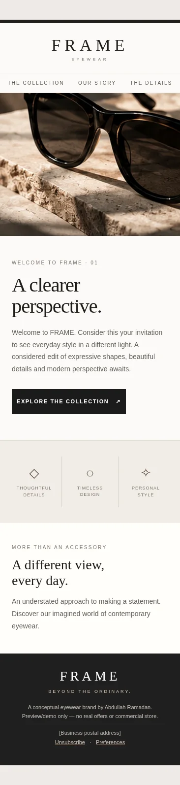
Each design has a working, responsive HTML demonstration and separate desktop and mobile captures taken from the actual template—not just a static mockup.
01 · WELCOME
A clearer perspective.
An elevated first impression: introduce the brand, establish its values and offer one clear path to explore.
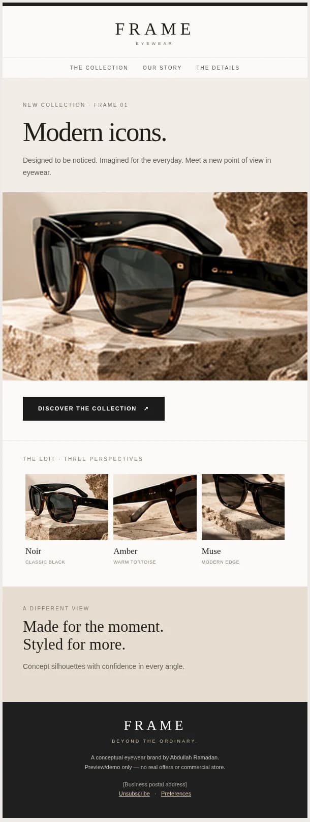
02 · PRODUCT LAUNCH
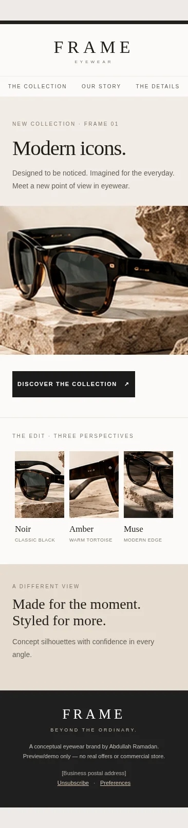
Modern icons.
A new-collection announcement built around a generous hero image, restrained product edit and a single launch CTA.
03 · ABANDONED CART
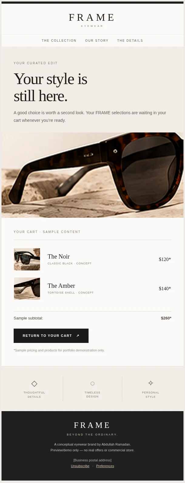
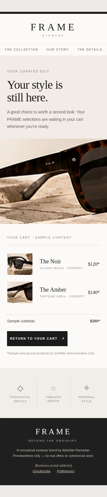
Your style is still here.
A respectful follow-up with visible cart products, an optional sample subtotal and a direct route back to checkout.
04 / RESPONSIVE PRODUCTION
Designed beyond the mockup.
Three downloadable HTML templates use practical email table layouts, inline visual styling and a mobile-width CSS adjustment. Accessible alt text and preheader copy are included. The example is tested in desktop and mobile Chromium; live email-client support must still be confirmed before sending.