A specialist brand built around openings.
EGYPEN works across UPVC windows, doors and shower enclosures, so the identity needed to communicate the category before the viewer even reached the descriptor.
A gateway to modern spaces.
A confident identity shaped directly by the product itself — window geometry, structural frames and a door terminal become a single architectural wordmark.
The identity is deliberately engineered and architectural. Strong frames and hard edges echo UPVC profiles and construction geometry rather than decorative logo trends.
Structural charcoal carries durability and confidence, while signal red becomes a precise recognition cue through the handle and controlled brand accents.
EGYPEN works across UPVC windows, doors and shower enclosures, so the identity needed to communicate the category before the viewer even reached the descriptor.
The mark had to reference the product directly while remaining architectural, scalable and strong enough for storefronts, profiles, vehicles, print and digital media.
The wordmark becomes an architectural passage. An open window starts the reading path, the name connects the structure, and the final N resolves into a framed door with a red handle.
Repeated frame weight, hard edges, horizontal rhythm and a restrained charcoal-red-white palette turn the logo into a system that can extend across real architectural surfaces.
Logo Anatomy
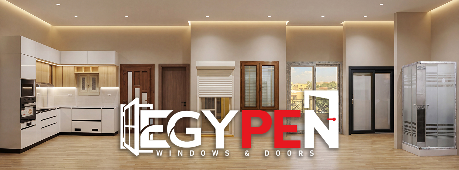
The category is visible before the descriptor is read: window at the entry, door at the terminal.
Window geometry, letter strokes and the door frame share a similar visual mass and structural rhythm.
The wide horizontal system is built for storefronts, UPVC profiles, vehicles, catalogues and digital media.
Applications preserve the same charcoal, white and red language while keeping windows, doors and glass systems visually dominant.
Windows · Doors · Shower Enclosures
Dark architectural application
Multi-product brand communication
Premium glass and frame presentation
#2D2D2D — technical, durable and architectural.
#ED1C24 — a focused recognition color for handles and accents.
#FFFFFF — clean contrast associated with glass, light and precision.
View the work in detail, explore its visual direction, and save your favorites.