01 / AMER TRAVEL
A distinctive mark for the journey ahead.
AMER TRAVEL is a flight-booking company. The logo combines the initial A, a flight silhouette and an orbital gesture into a single travel-led symbol, finished in a cool blue gradient.
 AMER TRAVEL ↗
Movement, built into the letterform.
The central A provides immediate name recognition. The aircraft and sweeping orbital line bring the language of routes, motion and air travel into the mark without requiring an extra icon.
AMER TRAVEL / LOGO DESIGNBlue with a sense of movement.
A family of cyan-to-deep-blue tones supports the sense of sky, connectivity and a contemporary travel service. The mark remains the focal point against restrained dark or light surroundings.
Designed to travel.
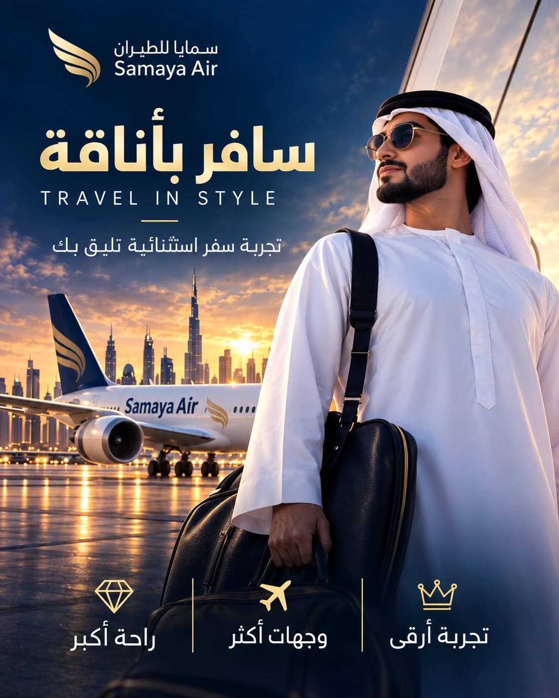
These business card and booking-document scenes are illustrative portfolio mockups created to demonstrate how the supplied logo could appear across travel touchpoints; they are not claimed client deliverables.