The challenge
Create a flexible advertising language that makes an imagined car-care collection feel connected while allowing each product to own its story.
Four everyday automotive products. One exacting visual language. AURON imagines a premium car-care collection through restrained typography, sculpted black packaging and directional light.
Explore the campaign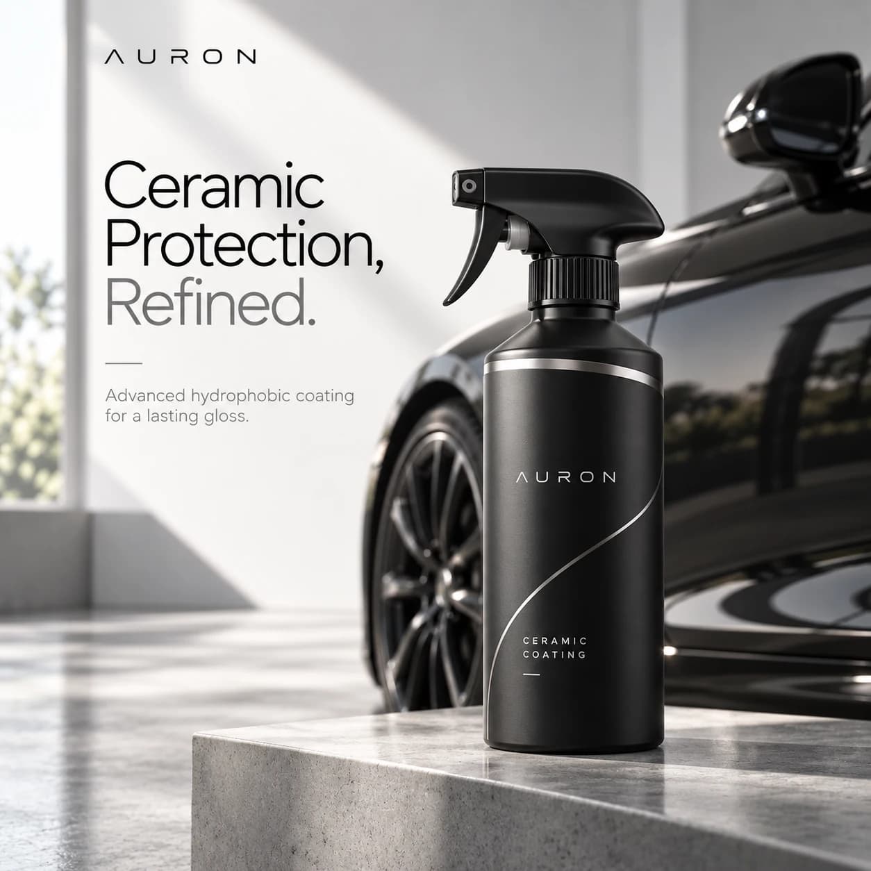
AURON is a fictional, self-initiated automotive-care brand concept. This project explores how a unified art direction can give four different product categories a distinctive, premium visual presence—without overcrowding the frame.
Create a flexible advertising language that makes an imagined car-care collection feel connected while allowing each product to own its story.
Keep the product in focus. Pair matte-black containers with metallic silver gestures, neutral architectural spaces, refined editorial type and carefully chosen automotive settings.
The AURON concept uses the same distinctive wordmark treatment, curved silver graphic and studio-light vocabulary throughout the collection. The result is a campaign family—not four unrelated advertisements.
#171819#8E9092#D6D7D5#F5F5F3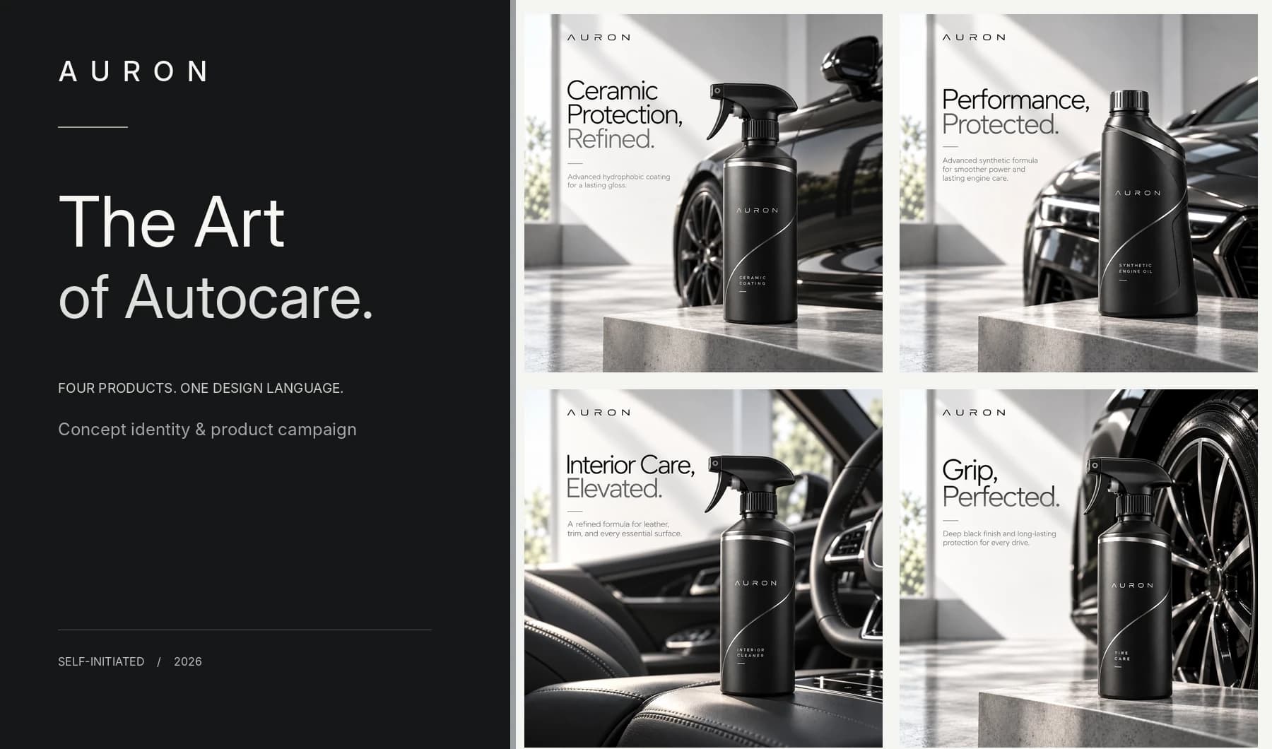
Each visual gives its product a dedicated backdrop while retaining the typography, palette and compositional rules of the campaign.
Reflective bodywork, a matte trigger bottle and architectural sunlight introduce the visual language.
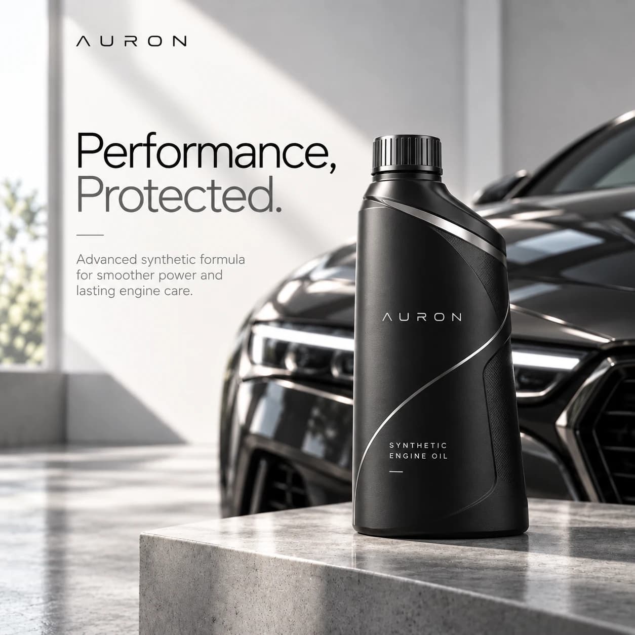
A sculpted engine-oil container meets the dark, high-contrast front end of a concept luxury car.
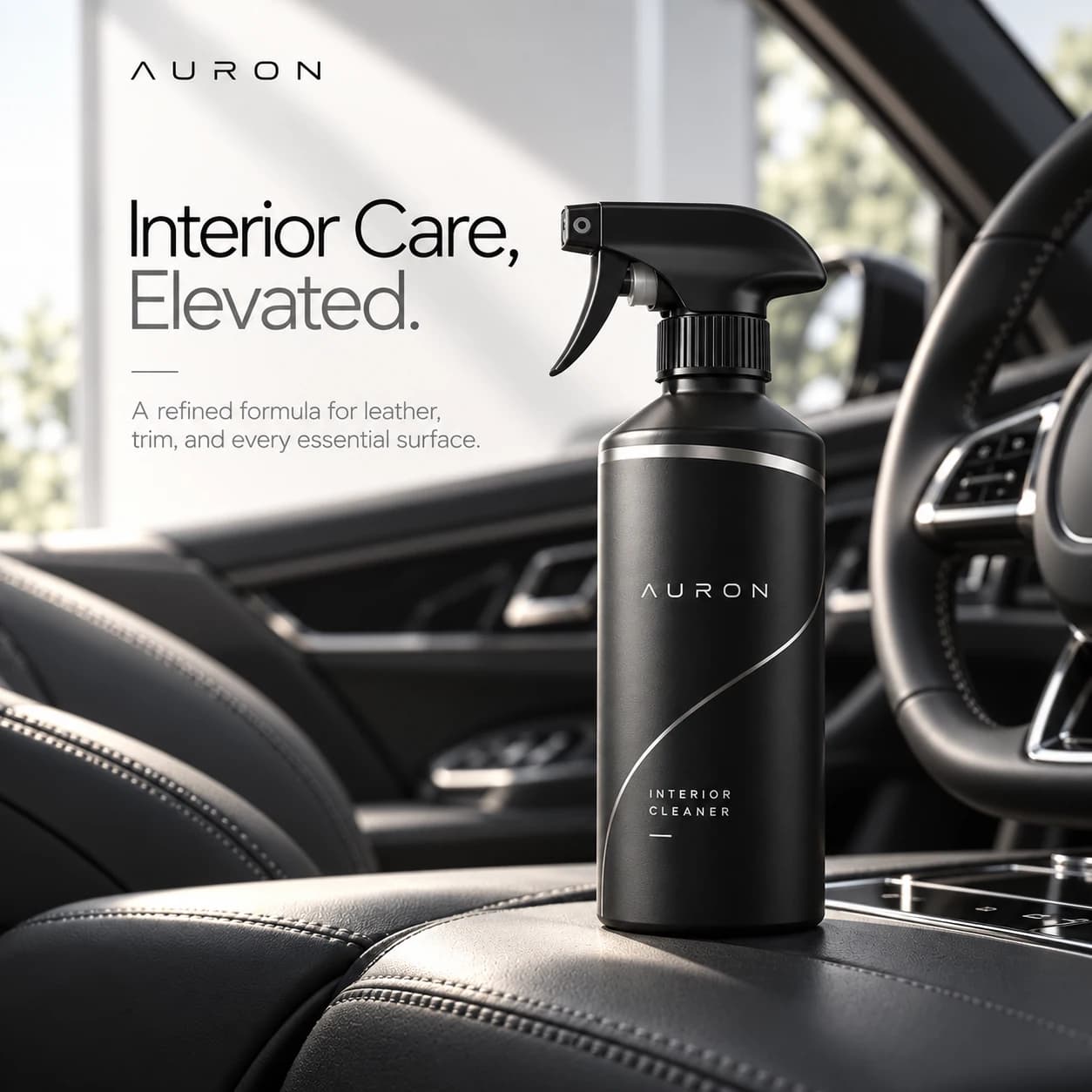
Subtle leather textures and interior details shift the campaign into a more intimate environment.
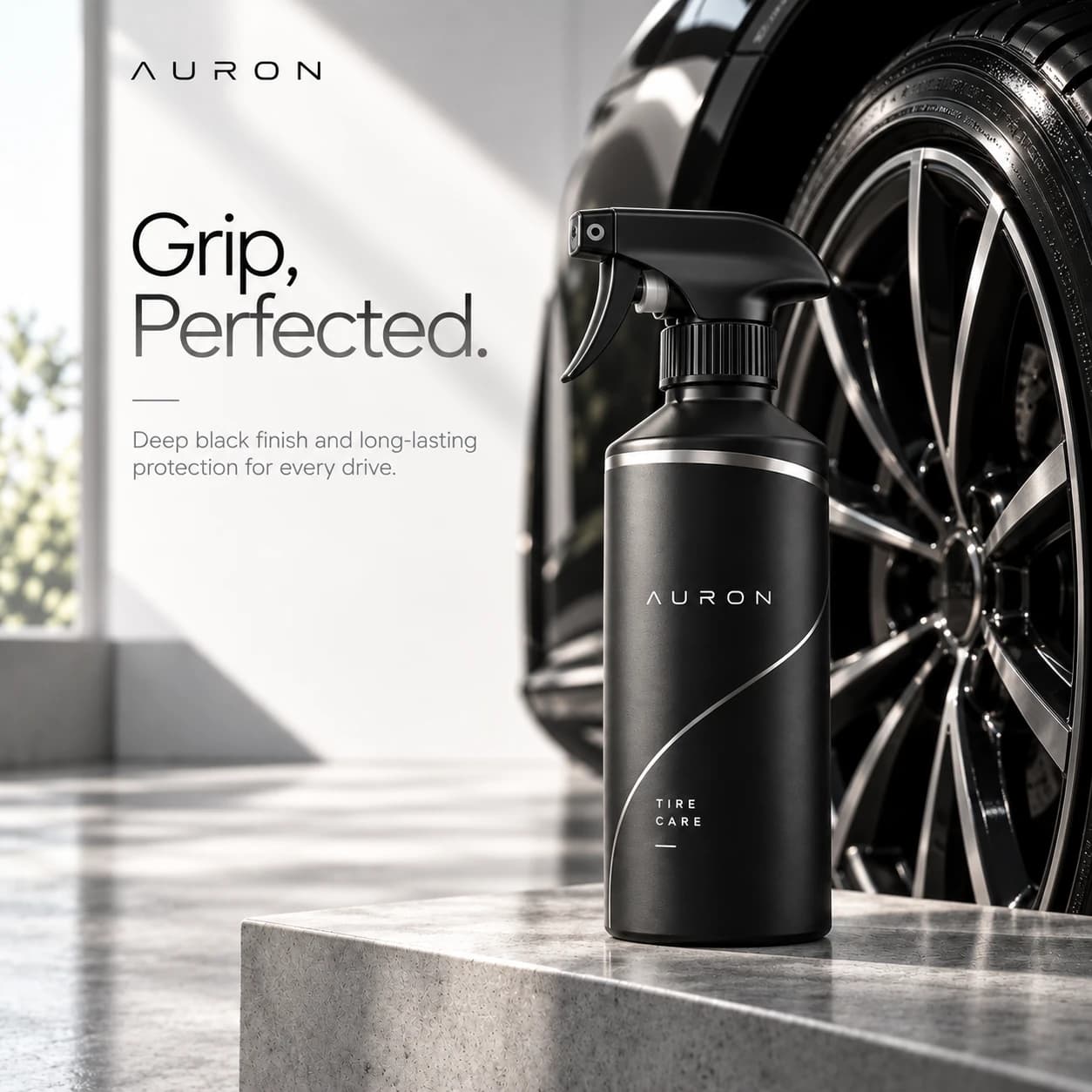
Wheel geometry and metallic highlights create a strong final composition for the imagined tire-care range.
View the work in detail, explore its visual direction, and save your favorites.